
How I align teams with clear design rationale
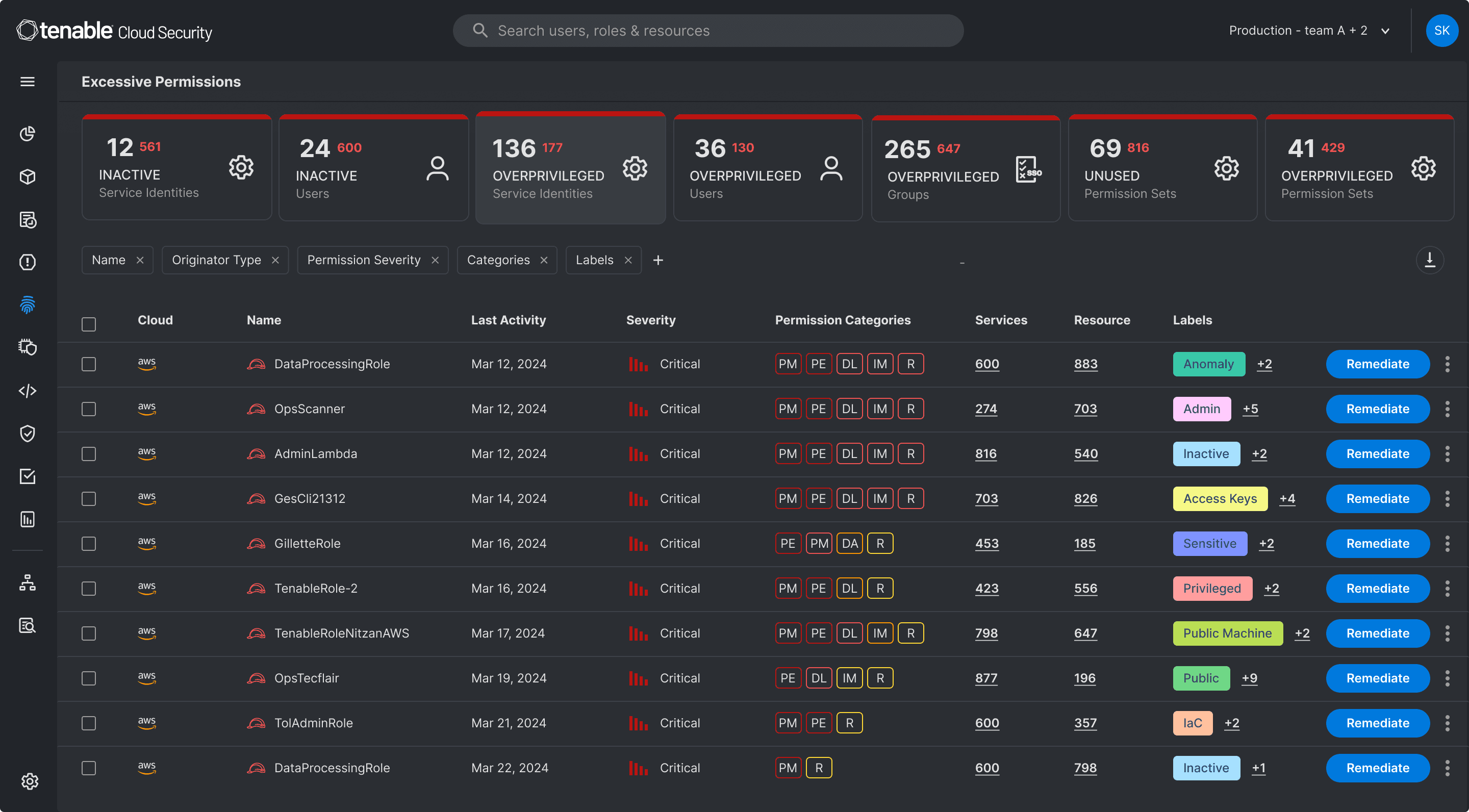
I noticed our product was heavily used at night, but the bright interface caused eye strain and reduced usability. The team was initially hesitant to invest in a full dark mode, so I framed the problem around user behavior—late-night usage and fatigue—and tied it to a business opportunity: better retention for those power users. My insight was that in low light or when fatigued, users struggle to differentiate similarly colored icons. I proposed a dark mode with distinct, carefully chosen colors for each icon to maximize contrast and legibility. By walking through simple before/after scenarios in a design review, I showed how this small change dramatically reduced cognitive load. The team aligned on the strategy, and we shipped the dark mode, resulting in positive user feedback and increased nighttime engagement.

Delivering high-impact features at scale
I shipped a white label platform for our product, a feature that allowed multiple brands to use our core tool with their own branding and configurations. The complexity came from balancing a single codebase with deeply varied visual and functional requirements. My role was to define the design system that could flex across brands without introducing technical debt, working closely with engineers to set constraints and with stakeholders to validate each brand’s needs. The outcome was a successful launch that greatly impacted the product by opening new markets and revenue streams.
Crafting pixel-perfect interfaces with soul
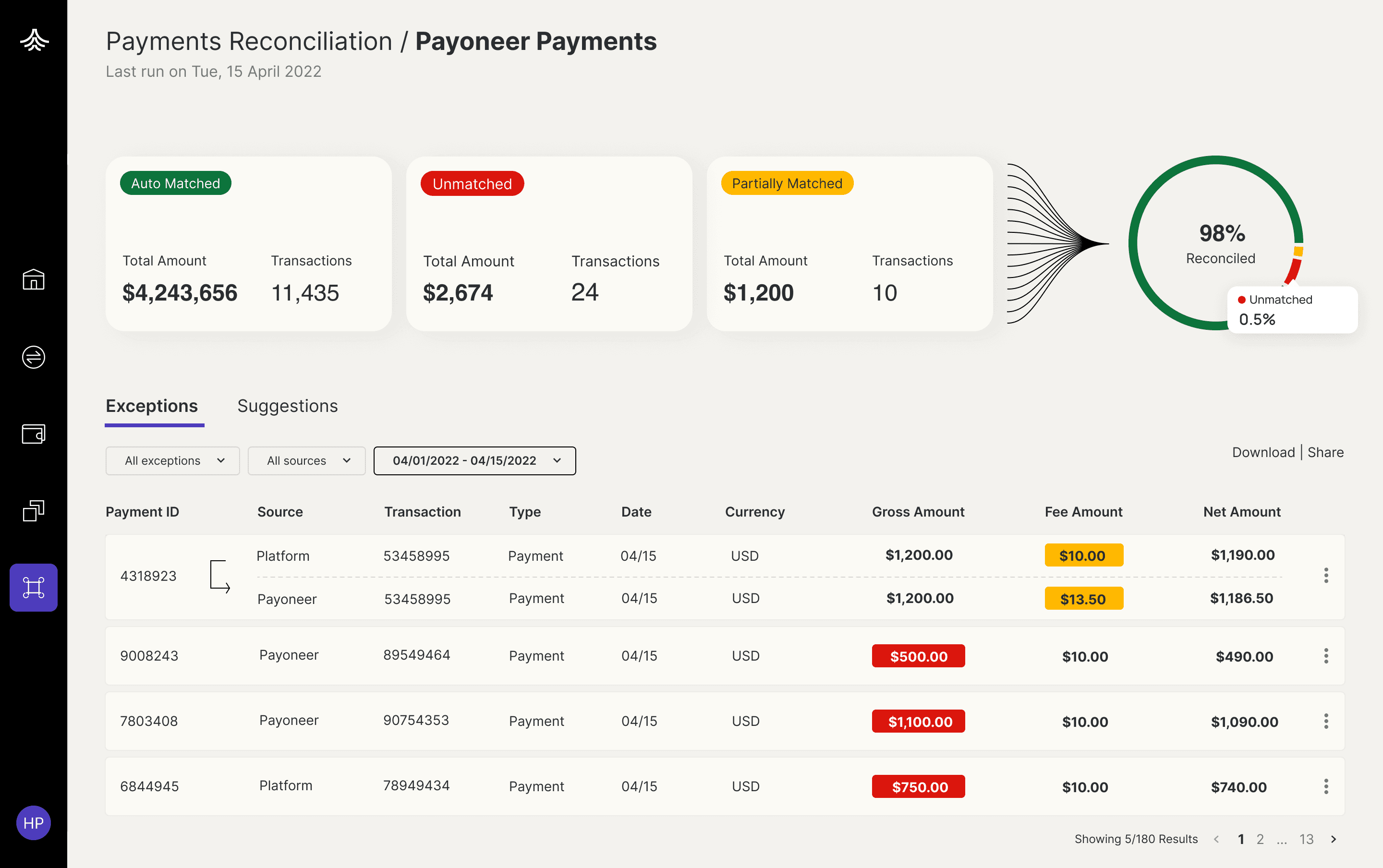
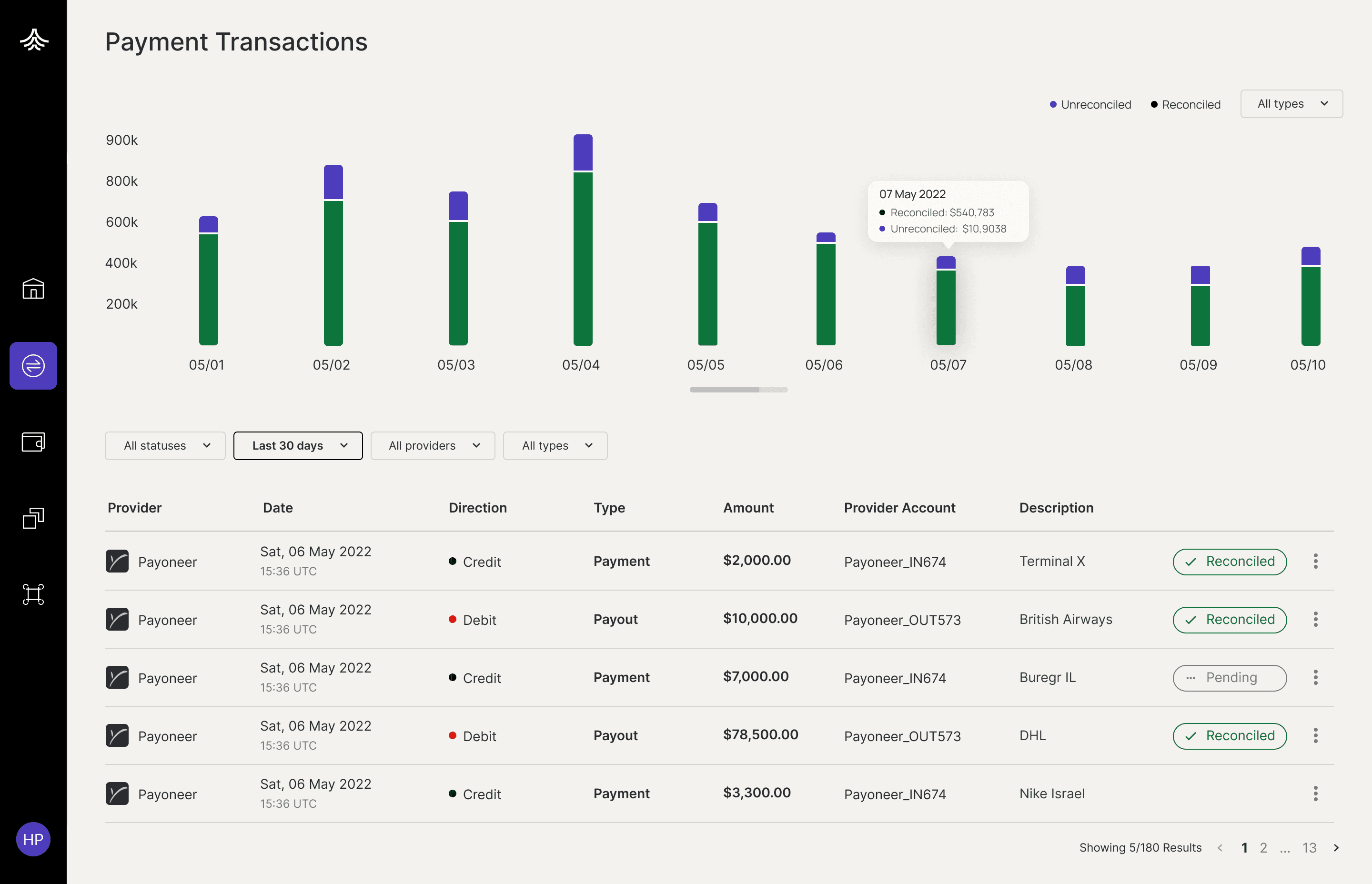
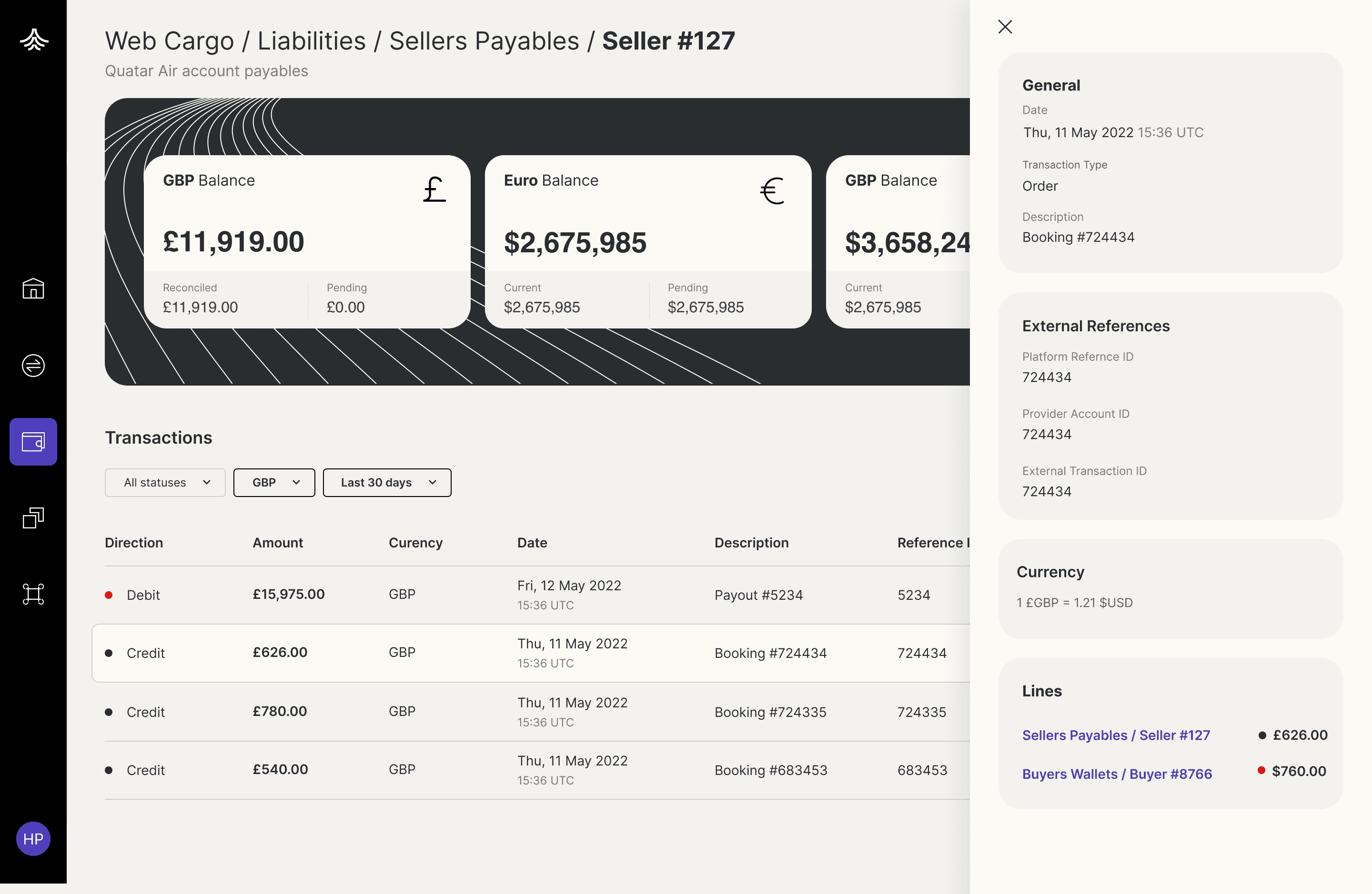
As the solo designer leading a full redesign, I focused on transforming dense, overwhelming data into a calm, navigable interface. Every margin and type scale was deliberately set to create breathing room, tightening the vertical rhythm where information grouped naturally and expanding it between sections to give the user’s eye a rest. I chose a restrained color palette with one accent color used sparingly for primary actions, so nothing felt noisy. The result was a UI that felt approachable and trustworthy, where users could scan complex information without anxiety.

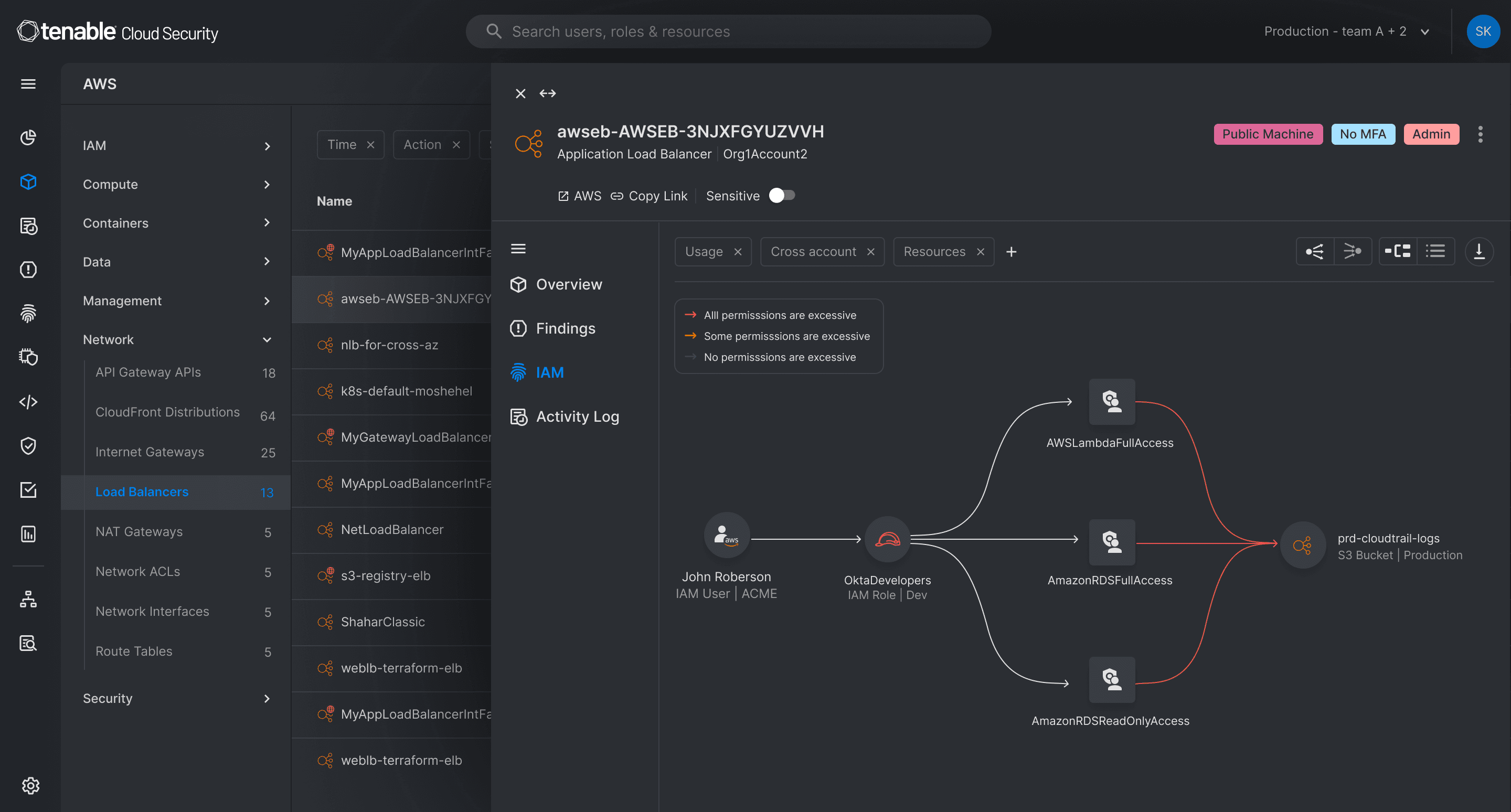
Prototyping with code to accelerate design decisions
For the Ermetic website redesign, I built a full prototype with animations and motion graphics to simulate the final user experience before development began. Having that interactive version early let the team make faster decisions on transitions, micro-interactions, and overall flow — we could see exactly how the design would behave without waiting for engineering implementation. This reduced back-and-forth during handoff and gave stakeholders a concrete reference to align on.
Bridging design and engineering through shared language
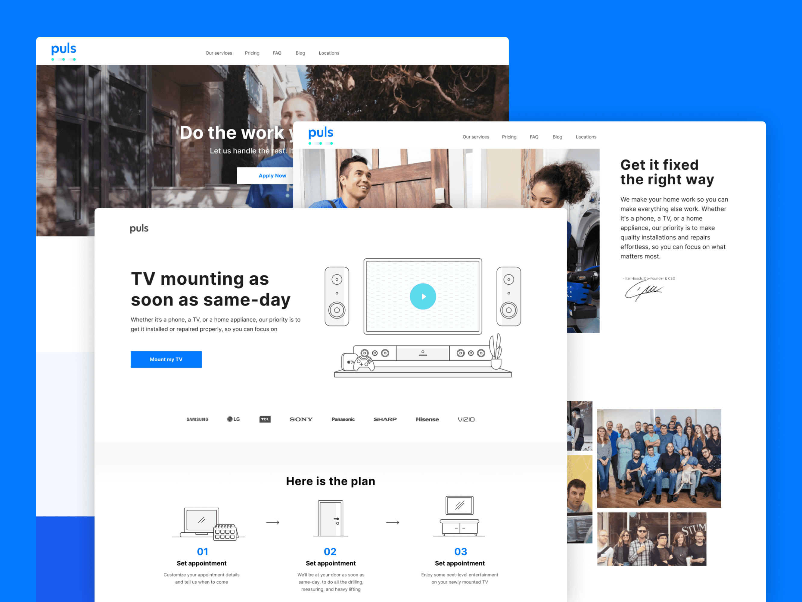
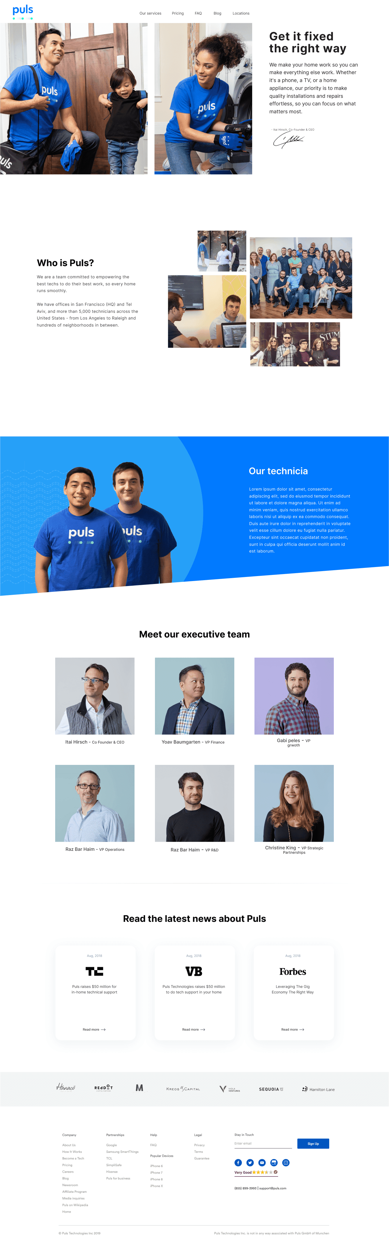
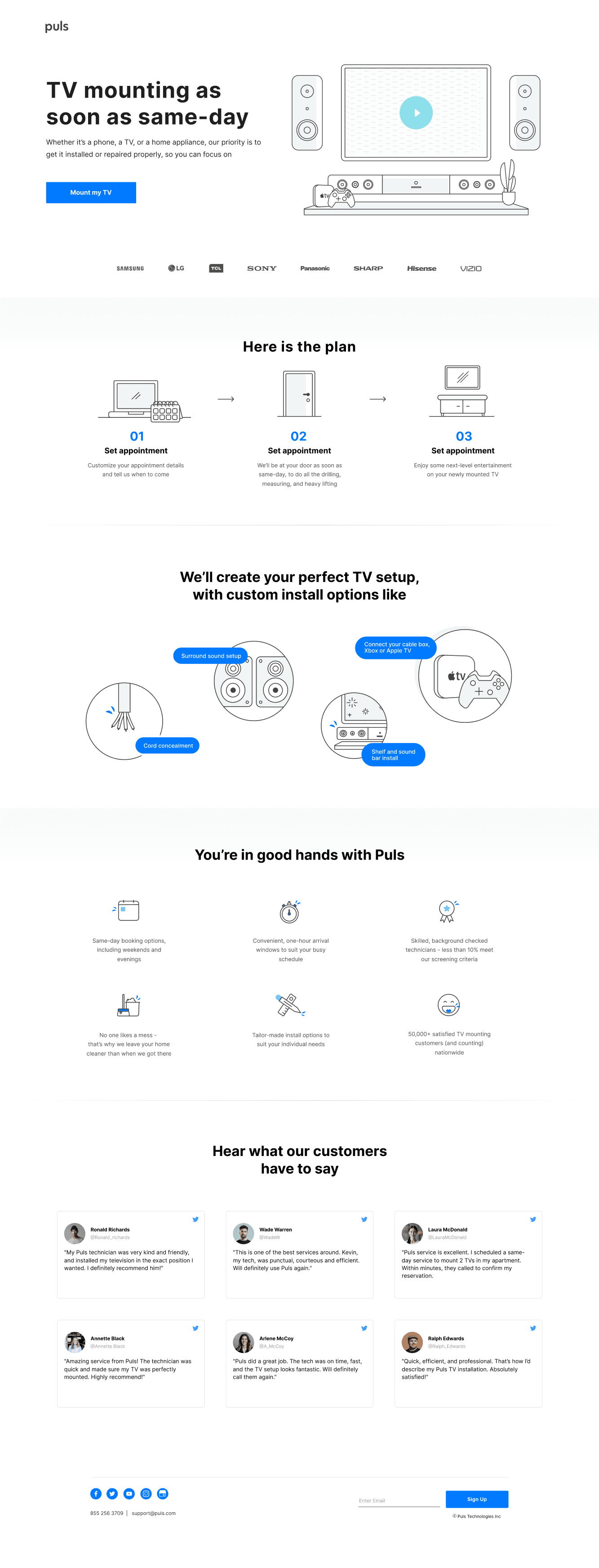
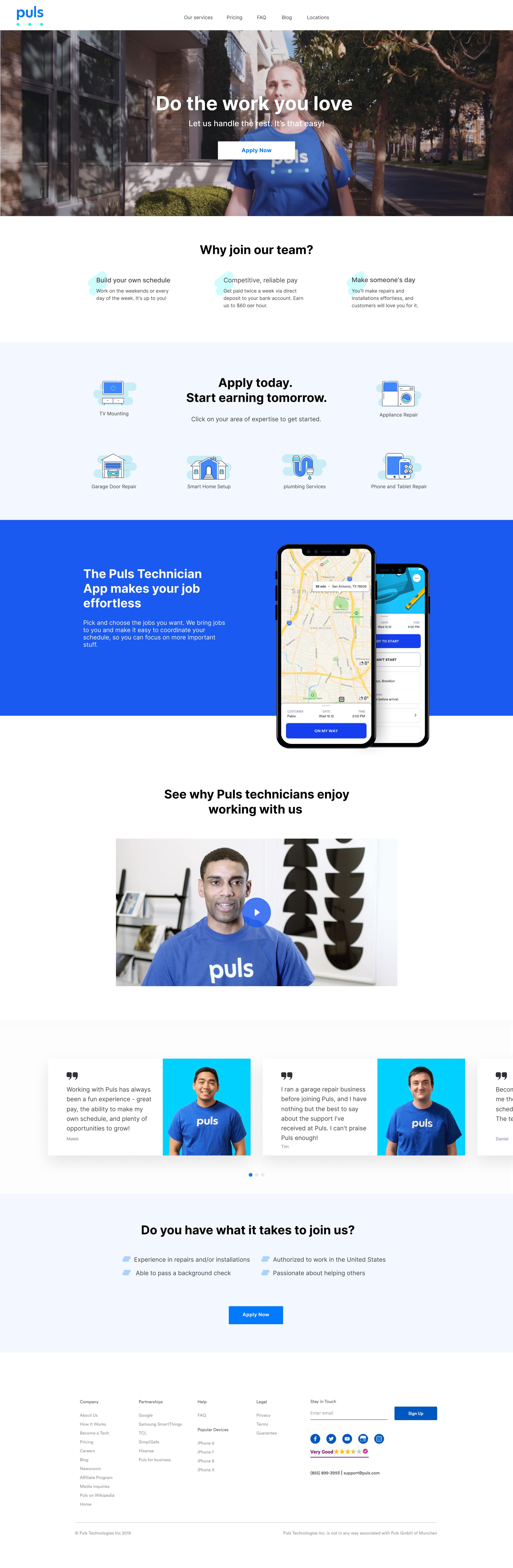
On the Puls website project, I owned both the design and the frontend implementation. I moved from mockups straight into code, which forced me to think through every interaction as both a designer and a developer—ensuring the visual intent survived real CSS constraints. Working this way gave me a deep understanding of what makes a design feasible to build, and it made collaboration with backend engineers smoother because I could discuss tradeoffs in their terms rather than waiting for handoff.
More work & links


 Made with